Available for New Projects

Available for New Projects
Available for New Projects
Available for New Projects
Available for New Projects
Available for New Projects
Available for New Projects
Building a Global Home
for STEM Innovation
and Education
Building a Global Home
for STEM Innovation
and Education
Building a Global Home
for STEM Innovation
and Education
Building a Global Home
for STEM Innovation
and Education
Building a Global Home
for STEM Innovation
and Education
Building a Global Home
for STEM Innovation
and Education
B2B
B2B
B2B
B2B
B2B
Web Design
Web Design
Web Design
Web Design
Web Design
Wordpress
Wordpress
Wordpress
Wordpress
Wordpress

My Role
My Role
My Role
My Role
My Role
UI/UX Designer -
Research, IA, Wire-Framing,
Visual Design, Interaction Design,
Rapid Prototyping, Design Testing
UI/UX Designer -
Research, IA, Wire-Framing,
Visual Design, Interaction Design,
Rapid Prototyping, Design Testing
UI/UX Designer -
Research, IA, Wire-Framing,
Visual Design, Interaction Design,
Rapid Prototyping, Design Testing
UI/UX Designer -
Research, IA, Wire-Framing,
Visual Design, Interaction Design,
Rapid Prototyping, Design Testing
UI/UX Designer -
Research, IA, Wire-Framing,
Visual Design, Interaction Design,
Rapid Prototyping, Design Testing
Client
Client
Client
Client
Client
World STEM Foundation (WSF)
World STEM Foundation (WSF)
World STEM Foundation (WSF)
World STEM Foundation (WSF)
World STEM Foundation (WSF)
Industry
Industry
Industry
Industry
Industry
Education (B2B)
Education (B2B)
Education (B2B)
Education (B2B)
Education (B2B)
Company
Company
Company
Company
Company
Moshi Moshi
Moshi Moshi
Moshi Moshi
Moshi Moshi
Moshi Moshi
Release Date
Release Date
Release Date
Release Date
Release Date
2025
2025
2025
2025
2025
Website Link
Website Link
Website Link
Website Link
Website Link
About The Project
About The Project
About The Project
About The Project
About The Project
World STEM Foundation (WSF), a globally recognised accreditation and certification body in STEM education, approached us to establish their first digital presence. While their authority and impact were well recognised offline, the absence of a structured platform made it challenging to clearly communicate their mission, certification framework, and accreditation journeys to institutions, educators, and students.
World STEM Foundation (WSF), a globally recognised accreditation and certification body in STEM education, approached us to establish their first digital presence. While their authority and impact were well recognised offline, the absence of a structured platform made it challenging to clearly communicate their mission, certification framework, and accreditation journeys to institutions, educators, and students.
World STEM Foundation (WSF), a globally recognised accreditation and certification body in STEM education, approached us to establish their first digital presence. While their authority and impact were well recognised offline, the absence of a structured platform made it challenging to clearly communicate their mission, certification framework, and accreditation journeys to institutions, educators, and students.
World STEM Foundation (WSF), a globally recognised accreditation and certification body in STEM education, approached us to establish their first digital presence. While their authority and impact were well recognised offline, the absence of a structured platform made it challenging to clearly communicate their mission, certification framework, and accreditation journeys to institutions, educators,
and students.
World STEM Foundation (WSF), a globally recognised accreditation and certification body in STEM education, approached us to establish their first digital presence. While their authority and impact were well recognised offline, the absence of a structured platform made it challenging to clearly communicate their mission, certification framework, and accreditation journeys to institutions, educators, and students.
World STEM Foundation (WSF), a globally recognised accreditation and certification body in STEM education, approached us to establish their first digital presence. While their authority and impact were
well recognised offline, the absence
of a structured platform made it challenging to clearly communicate
their mission, certification framework,
and accreditation journeys to
institutions, educators, and students.


Problem
Problem
Problem
Problem
Problem
Problem
WSF operates within a complex, multi-stakeholder STEM ecosystem where institutions, educators, students, and organisations seek accreditation at different competency levels. However, the lack of a structured digital experience made it difficult for users to identify the right certification path, understand the accreditation process, and navigate the system with confidence. This complexity created cognitive overload, reduced clarity, and limited WSF’s ability to scale its certification framework digitally.
WSF operates within a complex, multi-stakeholder STEM ecosystem where institutions, educators, students, and organisations seek accreditation at different competency levels. However, the lack of a structured digital experience made it difficult for users to identify the right certification path, understand the accreditation process, and navigate the system with confidence. This complexity created cognitive overload, reduced clarity, and limited WSF’s ability to scale its certification framework digitally.
WSF operates within a complex, multi-stakeholder STEM ecosystem where institutions, educators, students, and organisations seek accreditation at different competency levels. However, the lack of a structured digital experience made it difficult for users to identify the right certification path, understand the accreditation process, and navigate the system with confidence. This complexity created cognitive overload, reduced clarity, and limited WSF’s ability to scale its certification framework digitally.
WSF operates within a complex, multi-stakeholder STEM ecosystem where institutions, educators, students, and organisations seek accreditation at different competency levels. However, the lack of a structured digital experience made it difficult for users to identify the right certification path, understand the accreditation process, and navigate the system with confidence. This complexity created cognitive overload, reduced clarity, and limited WSF’s ability to scale its certification framework digitally.
WSF operates within a complex, multi-stakeholder STEM ecosystem where institutions, educators, students, and organisations seek accreditation at different competency levels. However, the lack of a structured digital experience made it difficult for users to identify the right certification path, understand the accreditation process, and navigate the system with confidence. This complexity created cognitive overload, reduced clarity, and limited WSF’s ability to scale its certification framework digitally.
Our Approach
Our Approach
Our Approach
Our Approach
Our Approach
Our Approach
Here’s how we addressed each challenge:
Here’s how we addressed each challenge:
Here’s how we addressed each challenge:
Here’s how we addressed
each challenge:
Here’s how we addressed each challenge:
Collaborated closely with stakeholders to understand WSF’s accreditation ecosystem and core verticals.
Structured the homepage to surface key verticals early, with distinct visual themes for clear differentiation.
Simplified navigation and information hierarchy to reduce clutter and improve discoverability.
Designed the accreditation journey as a clear, step-by-step flow to minimise cognitive load.
Established a modern, tech-forward visual language with human-centric imagery and subtle interactions,
ensuring clarity and credibility across devices.
Collaborated closely with stakeholders to understand WSF’s accreditation ecosystem and core verticals.
Structured the homepage to surface key verticals early, with distinct visual themes for clear differentiation.
Simplified navigation and information hierarchy to reduce clutter and
improve discoverability.
Designed the accreditation journey as a clear, step-by-step flow to minimise cognitive load.
Established a modern, tech-forward visual language with human-centric imagery
and subtle interactions, ensuring clarity
and credibility across devices.
Collaborated closely with stakeholders to understand WSF’s accreditation ecosystem and core verticals.
Structured the homepage to surface key verticals early, with distinct visual themes for clear differentiation.
Simplified navigation and information hierarchy to reduce clutter and improve discoverability.
Designed the accreditation journey as a clear, step-by-step flow to minimise cognitive load.
Established a modern, tech-forward visual language with human-centric imagery and subtle interactions,
ensuring clarity and credibility across devices.
Collaborated closely with stakeholders to understand WSF’s accreditation ecosystem and core verticals.
Structured the homepage to surface key verticals early, with distinct
visual themes for clear differentiation.
Simplified navigation and information hierarchy to reduce clutter
and improve discoverability.
Designed the accreditation journey as a clear, step-by-step
flow to minimise cognitive load.
Established a modern, tech-forward visual language with human-centric imagery and subtle interactions, ensuring clarity and credibility across devices.
Collaborated closely with stakeholders to understand WSF’s accreditation ecosystem and core verticals.
Structured the homepage to surface key verticals early, with distinct visual themes for clear differentiation.
Simplified navigation and information hierarchy to reduce clutter and improve discoverability.
Designed the accreditation journey as a clear, step-by-step flow to minimise cognitive load.
Established a modern, tech-forward visual language with human-centric imagery and subtle interactions, ensuring clarity and credibility
across devices.
Collaborated closely with stakeholders to understand WSF’s accreditation ecosystem
and core verticals.
Structured the homepage to surface key verticals early, with distinct visual themes for clear differentiation.
Simplified navigation and information hierarchy
to reduce clutter and improve discoverability.
Designed the accreditation journey as a clear, step-by-step flow to minimise cognitive load.
Established a modern, tech-forward visual language with human-centric imagery
and subtle interactions, ensuring clarity
and credibility across devices.


Inside the Process
Inside the Process
Inside the Process
Inside the Process
Inside the Process
Inside the Process
Discovery & Briefing
Discovery & Briefing
Discovery & Briefing
Discovery & Briefing
Discovery & Briefing
Discovery & Briefing
The process began with weekly stakeholder discussions to align on brand vision, user needs, competitor context, and visual direction. These inputs informed the information architecture early on. The approach then moved through competitor analysis, wireframing, and moodboarding, leading to a single focused UI concept approved in the first round and iterated into responsive, high-fidelity layouts supported by a cohesive style guide.
The process began with weekly stakeholder discussions to align on brand vision,
user needs, competitor context, and visual direction. These inputs informed the information architecture early on. The approach then moved through competitor analysis, wireframing, and moodboarding, leading to a single focused UI concept approved in the first round and iterated
into responsive, high-fidelity layouts supported
by a cohesive style guide.
The process began with weekly stakeholder discussions to align on brand vision, user needs, competitor context, and visual direction. These inputs informed the information architecture early on. The approach then moved through competitor analysis, wireframing, and moodboarding, leading to a single focused UI concept approved in the first round and iterated into responsive, high-fidelity layouts supported by a cohesive style guide.
The process began with weekly stakeholder discussions to align on brand vision,
user needs, competitor context, and visual direction. These inputs informed the information architecture early on. The approach then moved through competitor analysis, wireframing, and moodboarding, leading to a single focused UI concept approved in the first round and iterated into responsive, high-fidelity layouts supported by a cohesive style guide.
The process began with weekly stakeholder discussions to align on brand vision, user needs, competitor context, and visual direction. These inputs informed the information architecture early on. The approach then moved through competitor analysis, wireframing, and moodboarding, leading to a single focused UI concept approved in the first round and iterated into responsive, high-fidelity layouts supported by a cohesive style guide.
The process began with weekly stakeholder discussions to align on brand vision,
user needs, competitor context, and visual direction. These inputs informed the information architecture early on. The approach then moved through competitor analysis, wireframing, and moodboarding, leading to a single focused UI concept approved in the first round and iterated
into responsive, high-fidelity layouts supported
by a cohesive style guide.
Information Architecture
Information Architecture
Information Architecture
Information Architecture
Information Architecture
Information Architecture
Organised and structured all content by categorising pages and certification paths to bring clarity to a
complex accreditation ecosystem.
Organised and structured all content by categorising pages and certification
paths to bring clarity to a complex
accreditation ecosystem.
Organised and structured all content by categorising pages and certification paths to bring clarity to a
complex accreditation ecosystem.
Organised and structured all content by categorising pages and certification
paths to bring clarity to a complex accreditation ecosystem.
Organised and structured all content by categorising pages and certification
paths to bring clarity to a complex
accreditation ecosystem.
Organised and structured all content by categorising pages and certification
paths to bring clarity to a complex
accreditation ecosystem.


Concept & Wireframing
Concept & Wireframing
Concept & Wireframing
Concept & Wireframing
Concept & Wireframing
Concept & Wireframing
Translated the information architecture into low-fidelity wireframes to define the core experience concept. This phase focused on validating layout structure, content hierarchy, and navigation flows, ensuring key user journeys were intuitive and aligned before progressing to visual design.
Translated the information architecture into low-fidelity wireframes to define the core experience concept. This phase focused on validating layout structure, content hierarchy, and navigation flows, ensuring key user journeys were intuitive and aligned before progressing to visual design.
Translated the information architecture into low-fidelity wireframes to define the core experience concept. This phase focused on validating layout structure, content hierarchy, and navigation flows, ensuring key user journeys were intuitive and aligned before progressing to visual design.
Translated the information architecture into low-fidelity wireframes to define the core experience concept. This phase focused on validating layout structure, content hierarchy, and navigation flows, ensuring key user journeys were intuitive and aligned before progressing to visual design.
Translated the information architecture into low-fidelity wireframes to define the core experience concept. This phase focused on validating layout structure, content hierarchy, and navigation flows, ensuring key user journeys were intuitive and aligned before progressing to visual design.
Moodboarding & Visual Direction
Moodboarding & Visual Direction
Moodboarding & Visual Direction
Moodboarding & Visual Direction
Moodboarding & Visual Direction
Moodboarding & Visual Direction
In parallel with wireframing, explored visual directions to define a modern yet credible look for WSF. Moodboards, inspiration references, and typography explorations helped align on colour logic and imagery, while ensuring each vertical felt distinct within a cohesive system.
In parallel with wireframing, explored visual directions to define a modern yet credible look for WSF. Moodboards, inspiration references, and typography explorations helped align on colour logic and imagery, while ensuring each vertical felt distinct within a cohesive system.
In parallel with wireframing, explored visual directions to define a modern yet credible look for WSF. Moodboards, inspiration references, and typography explorations helped align on colour logic and imagery, while ensuring each vertical felt distinct within a cohesive system.
In parallel with wireframing, explored visual directions to define a modern yet credible look for WSF. Moodboards, inspiration references, and typography explorations helped align on colour logic and imagery, while ensuring each vertical felt distinct within a cohesive system.
In parallel with wireframing, explored visual directions to define a modern yet credible look for WSF. Moodboards, inspiration references, and typography explorations helped align on colour logic and imagery, while ensuring each vertical felt distinct within a cohesive system.

Experience & Interface Enhancements
Experience & Interface Enhancements
Experience & Interface Enhancements
Experience & Interface Enhancements
Experience & Interface Enhancements
Experience & Interface Enhancements
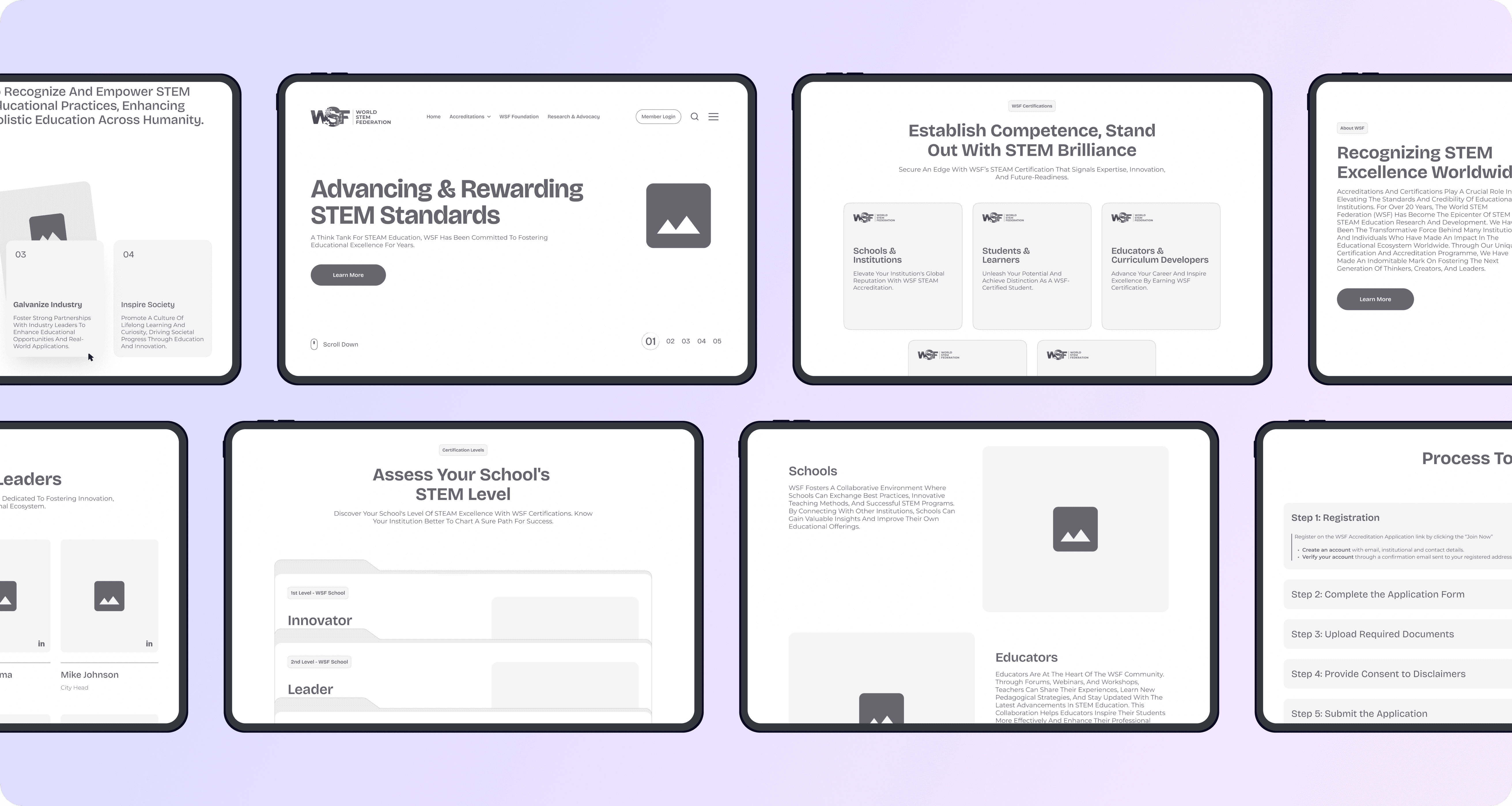
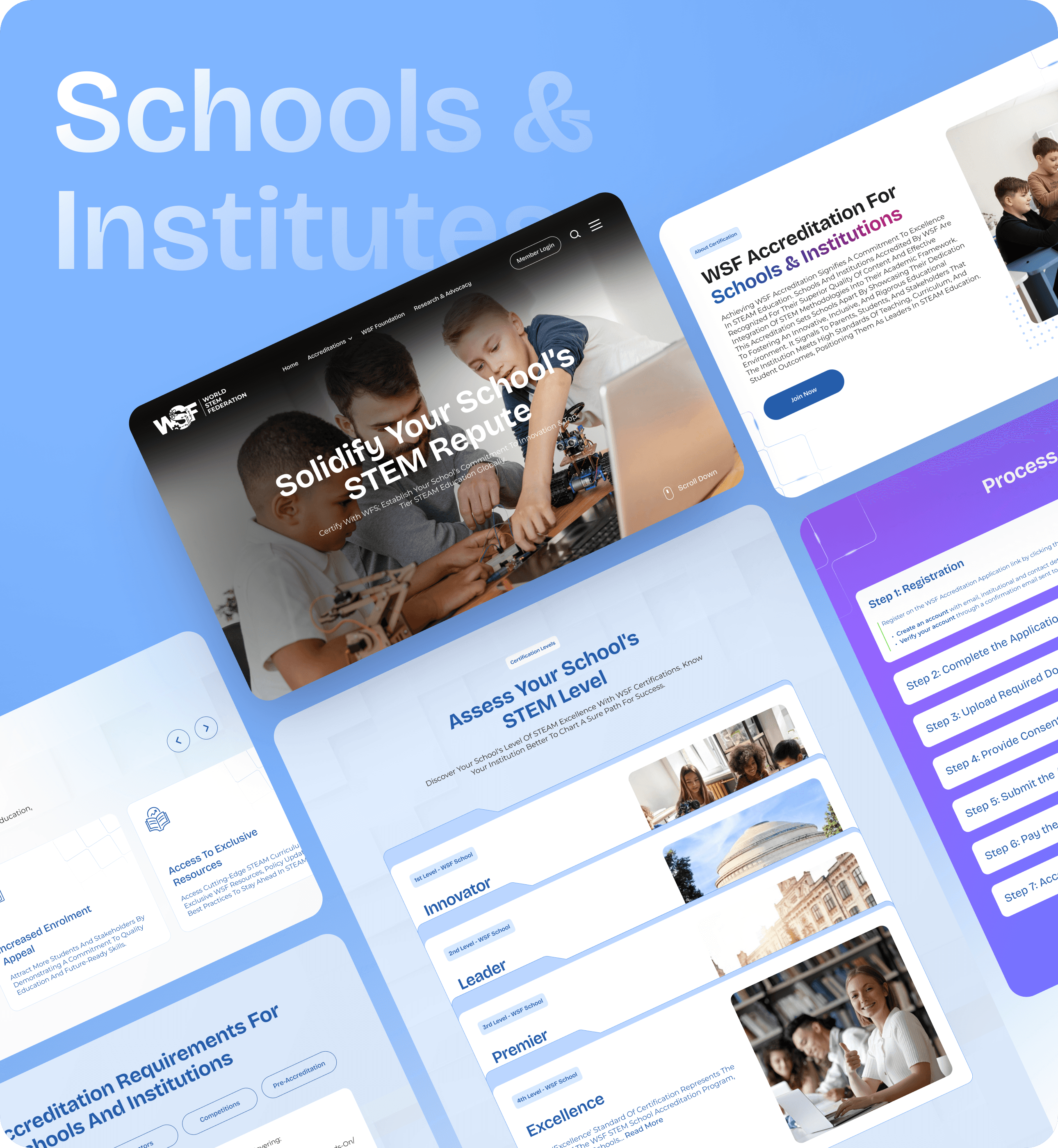
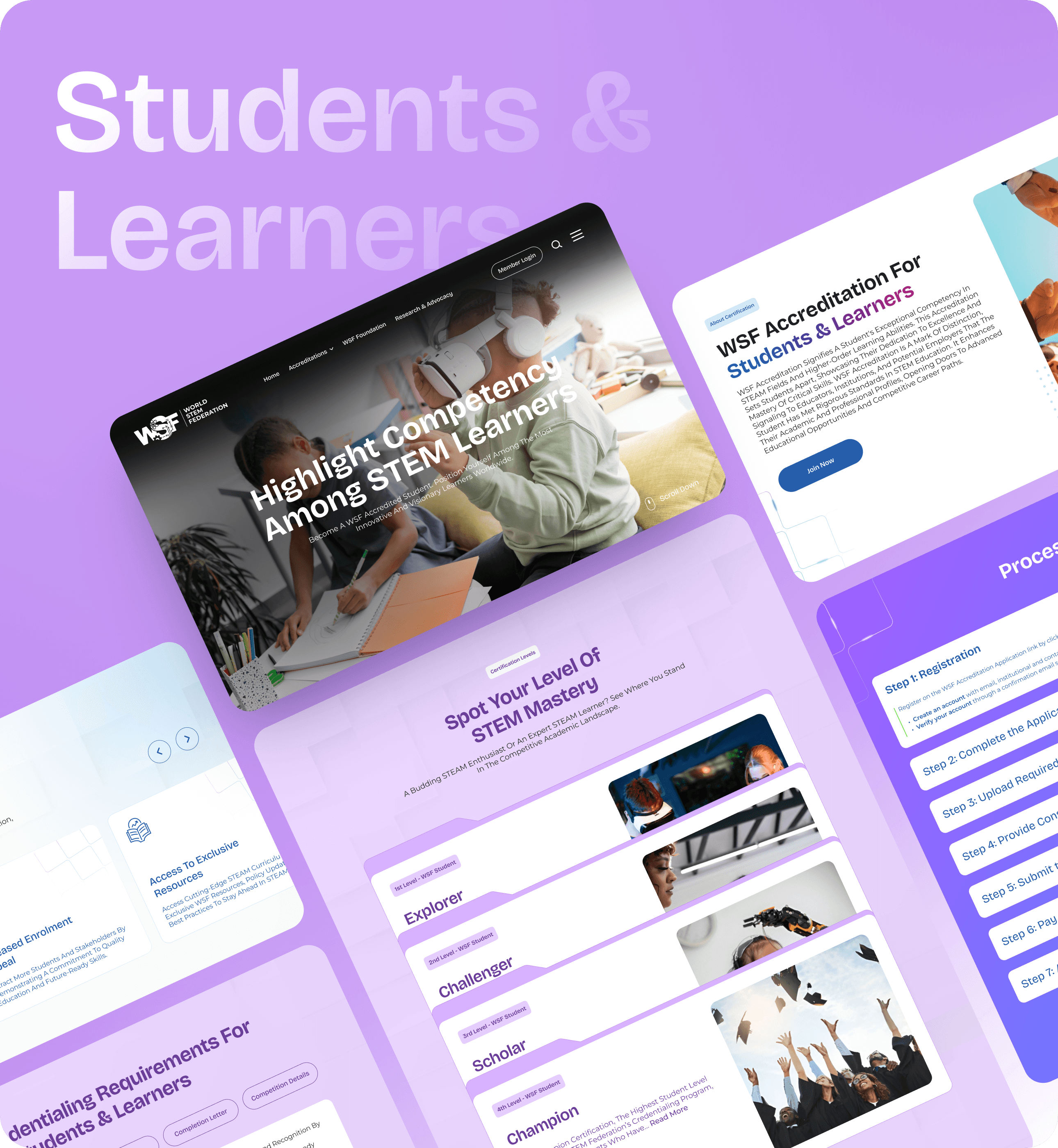
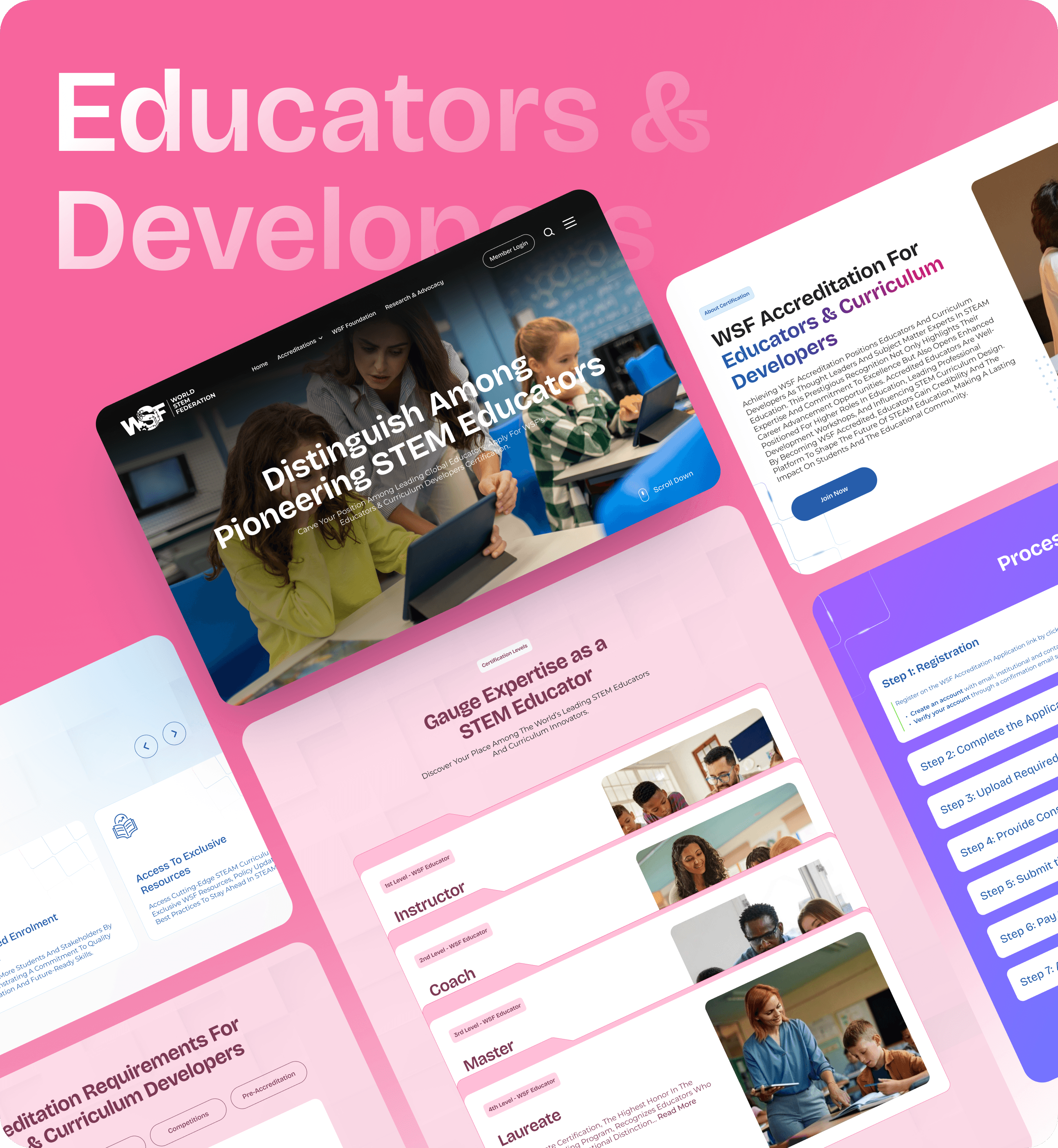
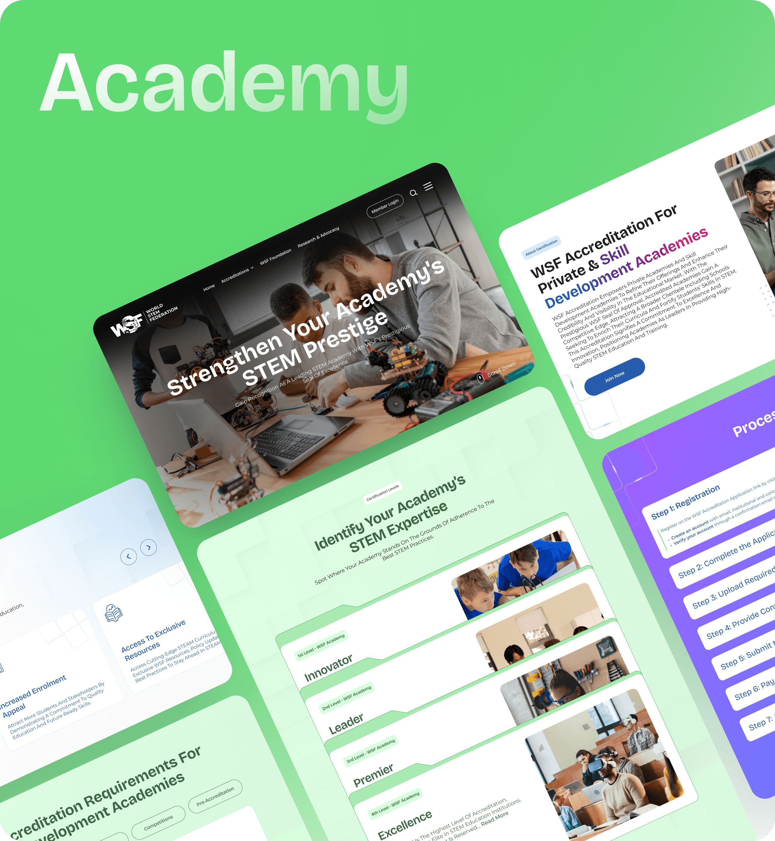
Surfaced the five core verticals below the hero using interactive card layouts, helping users quickly identify relevant paths.
Simplified the top navigation by prioritising key links and moving secondary items into a hamburger menu, while keeping member login prominently accessible for quick access.
Refined the overall experience by clarifying hierarchy, reducing visual noise, and establishing a modern,
cohesive visual language.
Introduced a carousel banner to highlight WSF’s core verticals, organisational context, and entry points
for free student membership.
Improved responsiveness to ensure a consistent experience across devices.
Surfaced the five core verticals below the hero using interactive card layouts, helping users quickly identify relevant paths.
Simplified the top navigation by prioritising
key links and moving secondary items into a hamburger menu, while keeping member
login prominently accessible for quick access.
Refined the overall experience by clarifying hierarchy, reducing visual noise, and
establishing a modern, cohesive
visual language.
Introduced a carousel banner to highlight WSF’s core verticals, organisational context, and entry points for free student membership.
Improved responsiveness to ensure a consistent experience across devices.
Surfaced the five core verticals below the hero using interactive card layouts, helping users quickly identify relevant paths.
Simplified the top navigation by prioritising key links and moving secondary items into a hamburger menu, while keeping member login prominently accessible for quick access.
Refined the overall experience by clarifying hierarchy, reducing visual noise, and establishing a modern,
cohesive visual language.
Introduced a carousel banner to highlight WSF’s core verticals, organisational context, and entry points
for free student membership.
Improved responsiveness to ensure a consistent experience across devices.
Surfaced the five core verticals below the hero using interactive card layouts, helping users quickly identify relevant paths.
Simplified the top navigation by prioritising key links and moving secondary
items into a hamburger menu, while keeping member login prominently
accessible for quick access.
Refined the overall experience by clarifying hierarchy, reducing
visual noise, and establishing a modern, cohesive visual language.
Introduced a carousel banner to highlight WSF’s core verticals,
organisational context, and entry points for free student membership.
Improved responsiveness to ensure a consistent experience across devices.
Surfaced the five core verticals below the hero using interactive card
layouts, helping users quickly
identify relevant paths.
Simplified the top navigation by prioritising key links and moving secondary items into a hamburger menu, while keeping member
login prominently accessible
for quick access.
Refined the overall experience by clarifying hierarchy, reducing visual noise, and establishing a modern, cohesive visual language.
Introduced a carousel banner to highlight WSF’s core verticals, organisational context, and entry points for free student membership.
Improved responsiveness to ensure
a consistent experience
across devices.
Surfaced the five core verticals below the hero using interactive card layouts, helping users quickly identify relevant paths.
Simplified the top navigation by prioritising
key links and moving secondary items into a hamburger menu, while keeping member
login prominently accessible for quick access.
Refined the overall experience by clarifying hierarchy, reducing visual noise, and
establishing a modern, cohesive
visual language.
Introduced a carousel banner to highlight WSF’s core verticals, organisational context, and entry points for free student membership.
Improved responsiveness to ensure a consistent experience across devices.


Simplifying the Accreditation Experience
Simplifying the Accreditation Experience
Simplifying the Accreditation Experience
Simplifying the Accreditation Experience
Simplifying the Accreditation Experience
Simplifying the Accreditation Experience
What I improved?
What I improved?
What I improved?
What I improved?
What I improved?
Gave each accreditation vertical a distinct visual treatment to improve recognition and reduce
confusion across different offerings.
Structured accreditation pages by levels to clearly communicate progression and
help users quickly identify where they fit.
Enabled users to assess eligibility at each level without navigating through dense or repetitive content.
Simplified accreditation requirements by presenting them in a tab-based layout, allowing users to view relevant criteria without scrolling through dense content.
Presented the application process as a clear, step-by-step flow to reduce cognitive load
and support confident progression.
Gave each accreditation vertical a distinct visual treatment to improve recognition and reduce confusion across different offerings.
Structured accreditation pages by levels to clearly communicate progression and
help users quickly identify where they fit.
Enabled users to assess eligibility at each
level without navigating through dense
or repetitive content.
Simplified accreditation requirements by presenting them in a tab-based layout,
allowing users to view relevant criteria
without scrolling through dense content.
Presented the application process as a clear, step-by-step flow to reduce cognitive load
and support confident progression.
Gave each accreditation vertical a distinct visual treatment to improve recognition and reduce
confusion across different offerings.
Structured accreditation pages by levels to clearly communicate progression and
help users quickly identify where they fit.
Enabled users to assess eligibility at each level without navigating through dense or repetitive content.
Simplified accreditation requirements by presenting them in a tab-based layout, allowing users to view relevant criteria without scrolling through dense content.
Presented the application process as a clear, step-by-step flow to reduce cognitive load
and support confident progression.
Gave each accreditation vertical a distinct visual treatment to improve recognition and reduce confusion across different offerings.
Structured accreditation pages by levels to clearly communicate progression and
help users quickly identify where they fit.
Enabled users to assess eligibility at each level without navigating
through dense or repetitive content.
Simplified accreditation requirements by presenting them in a tab-based layout, allowing users to view relevant criteria without scrolling through dense content.
Presented the application process as a clear, step-by-step flow to reduce cognitive load and support confident progression.
Gave each accreditation vertical a distinct visual treatment to improve recognition and reduce confusion across different offerings.
Structured accreditation pages by levels to clearly communicate progression and help users quickly identify where they fit.
Enabled users to assess eligibility at each level without navigating through dense or repetitive content.
Simplified accreditation requirements by presenting them in a tab-based layout, allowing users to view relevant criteria without scrolling through
dense content.
Presented the application process as
a clear, step-by-step flow to reduce cognitive load and support
confident progression.
Gave each accreditation vertical a distinct visual treatment to improve recognition and reduce confusion across different offerings.
Structured accreditation pages by levels to clearly communicate progression and
help users quickly identify where they fit.
Enabled users to assess eligibility at each
level without navigating through dense
or repetitive content.
Simplified accreditation requirements by presenting them in a tab-based layout,
allowing users to view relevant criteria
without scrolling through dense content.
Presented the application process as a clear, step-by-step flow to reduce cognitive load
and support confident progression.
Visual Language Refinement
Visual Language Refinement
Visual Language Refinement
Visual Language Refinement
Visual Language Refinement
Visual Language Refinement
The brand’s visual presence was elevated by refining the typographic system and introducing a fresh, modern colour palette. These updates improved readability, strengthened visual hierarchy, and brought greater consistency across the experience, while preserving the authority and credibility expected from a certification body.
The brand’s visual presence was elevated by refining the typographic system and introducing a fresh, modern colour palette. These updates improved readability, strengthened visual hierarchy, and brought greater consistency across the experience, while preserving the authority and credibility expected from a certification body.
The brand’s visual presence was elevated by refining the typographic system and introducing a fresh, modern colour palette. These updates improved readability, strengthened visual hierarchy, and brought greater consistency across the experience, while preserving the authority and credibility expected from a certification body.
The brand’s visual presence was elevated by refining the typographic system and introducing a fresh, modern colour palette. These updates improved readability, strengthened visual hierarchy, and brought greater consistency across the experience, while preserving the authority and credibility expected from a certification body.
The brand’s visual presence was elevated by refining the typographic system and introducing a fresh, modern colour palette. These updates improved readability, strengthened visual hierarchy, and brought greater consistency across the experience, while preserving the authority and credibility expected from a certification body.

The Impact
The
Impact
The Impact
The Impact
The
Impact
The
Impact
28
%
Improved accreditation application clarity by structuring flows and steps, helping users understand eligibility, required actions, and next steps across certifications.
28
%
Improved accreditation application clarity by structuring flows and steps, helping users understand eligibility, required actions, and next steps across certifications.
24
%
Faster navigation and wayfinding enabled by a simplified structure and clearer hierarchy, allowing users to reach key sections with reduced effort.
24
%
Faster navigation and wayfinding enabled by a simplified structure and clearer hierarchy, allowing users to reach key sections with reduced effort.
31
%
Increased discovery of core verticals by surfacing key offerings early, helping users quickly identify relevant programs and suitable entry points.
31
%
Increased discovery of core verticals by surfacing key offerings early, helping users quickly identify relevant programs and suitable entry points.
22
%
Mobile retention improved significantly once responsive layouts and simplified navigation made browsing smoother across smaller screen experiences.
22
%
Mobile retention improved significantly once responsive layouts and simplified navigation made browsing smoother across smaller screen experiences.
28
%
Improved accreditation application clarity by structuring flows and steps, helping users understand eligibility, required actions, and next steps across certifications.
28
%
Improved accreditation application clarity by structuring flows and steps, helping users understand eligibility, required actions, and next steps across certifications.
28
%
Improved accreditation application clarity by structuring flows and steps, helping users understand eligibility, required actions, and next steps across certifications.
28
%
Improved accreditation application clarity by structuring flows and steps, helping users understand eligibility, required actions, and next steps across certifications.
28
%
Improved accreditation application clarity by structuring flows and steps, helping users understand eligibility, required actions, and next steps across certifications.
28
%
Improved accreditation application clarity by structuring flows and steps, helping users understand eligibility, required actions, and next steps across certifications.
31
%
Increased discovery of core verticals by surfacing key offerings early, helping users quickly identify relevant programs and suitable entry points.
31
%
Increased discovery of core verticals by surfacing key offerings early, helping users quickly identify relevant programs and suitable entry points.
31
%
Increased discovery of core verticals by surfacing key offerings early, helping users quickly identify relevant programs and suitable entry points.
31
%
Increased discovery of core verticals by surfacing key offerings early, helping users quickly identify relevant programs and suitable entry points.
31
%
Increased discovery of core verticals by surfacing key offerings early, helping users quickly identify relevant programs and suitable entry points.
31
%
Increased discovery of core verticals by surfacing key offerings early, helping users quickly identify relevant programs and suitable entry points.
24
%
Faster navigation and wayfinding enabled by a simplified structure and clearer hierarchy, allowing users to reach key sections with reduced effort.
24
%
Faster navigation and wayfinding enabled by a simplified structure and clearer hierarchy, allowing users to reach key sections with reduced effort.
24
%
Faster navigation and wayfinding enabled by a simplified structure and clearer hierarchy, allowing users to reach key sections with reduced effort.
24
%
Faster navigation and wayfinding enabled by a simplified structure and clearer hierarchy, allowing users to reach key sections with reduced effort.
24
%
Faster navigation and wayfinding enabled by a simplified structure and clearer hierarchy, allowing users to reach key sections with reduced effort.
24
%
Faster navigation and wayfinding enabled by a simplified structure and clearer hierarchy, allowing users to reach key sections with reduced effort.
22
%
Mobile retention improved significantly once responsive layouts and simplified navigation made browsing smoother across smaller screen experiences.
22
%
Mobile retention improved significantly once responsive layouts and simplified navigation made browsing smoother across smaller screen experiences.
22
%
Mobile retention improved significantly once responsive layouts and simplified navigation made browsing smoother across smaller screen experiences.
22
%
Mobile retention improved significantly once responsive layouts and simplified navigation made browsing smoother across smaller screen experiences.
22
%
Mobile retention improved significantly once responsive layouts and simplified navigation made browsing smoother across smaller screen experiences.
22
%
Mobile retention improved significantly once responsive layouts and simplified navigation made browsing smoother across smaller screen experiences.
Let’s Talk Design
Let’s Talk Design
Let’s Talk Design