Available for New Projects

Available for New Projects
Available for New Projects
Available for New Projects
Available for New Projects
Available for New Projects
Available for New Projects
Digitally Transforming One
of India’s Most Trusted
Healthcare Brands
Digitally Transforming One
of India’s Most Trusted
Healthcare Brands
Digitally Transforming One
of India’s Most Trusted
Healthcare Brands
Digitally Transforming One
of India’s Most Trusted
Healthcare Brands
Digitally Transforming One
of India’s Most Trusted
Healthcare Brands
Digitally Transforming One
of India’s Most Trusted
Healthcare Brands
B2B
B2B
B2B
B2B
Web Design
Web Design
Web Design
Web Design
Full Stack
Full Stack
Full Stack
Full Stack

My Role
My Role
My Role
My Role
My Role
UI/UX Designer -
Research, IA, Wire-Framing,
Visual Design, Interaction Design,
Rapid Prototyping, Design Testing
UI/UX Designer -
Research, IA, Wire-Framing,
Visual Design, Interaction Design,
Rapid Prototyping, Design Testing
UI/UX Designer -
Research, IA, Wire-Framing,
Visual Design, Interaction Design,
Rapid Prototyping, Design Testing
UI/UX Designer -
Research, IA, Wire-Framing,
Visual Design, Interaction Design,
Rapid Prototyping, Design Testing
UI/UX Designer -
Research, IA, Wire-Framing,
Visual Design, Interaction Design,
Rapid Prototyping, Design Testing
Client
Client
Client
Client
Client
Romsons
Romsons
Romsons
Romsons
Romsons
Industry
Industry
Industry
Industry
Industry
Healthcare (B2B)
Healthcare (B2B)
Healthcare (B2B)
Healthcare (B2B)
Healthcare (B2B)
Company
Company
Company
Company
Company
Moshi Moshi
Moshi Moshi
Moshi Moshi
Moshi Moshi
Moshi Moshi
Release Date
Release Date
Release Date
Release Date
Release Date
2024
2024
2024
2024
2024
Website Link
Website Link
Website Link
Website Link
Website Link
About The Project
About The Project
About The Project
About The Project
About The Project
Romsons, a 70-year leader in medical devices, approached us to modernize their B2B website and align it with their global scale. With 250+ products and a presence in 65+ countries, their existing experience lacked organization, clarity, and ease of discovery.
Romsons, a 70-year leader in medical devices, approached us to modernize their B2B website and align it with their global scale. With 250+ products and a presence in 65+ countries, their existing experience lacked organization, clarity, and ease of discovery.
Romsons, a 70-year leader in medical devices, approached us to modernize their B2B website and align it with their global scale. With 250+ products and a presence in 65+ countries, their existing experience lacked organization, clarity, and ease of discovery.
Romsons, a 70-year leader in medical devices, approached us to modernize their B2B website and align it with their global scale. With 250+ products and a presence in 65+ countries, their existing experience lacked organization, clarity, and ease of discovery.
Romsons, a 70-year leader in medical devices, approached us to modernize their B2B website and align it with their global scale. With 250+ products and a presence in 65+ countries, their existing experience lacked organization, clarity, and ease of discovery.
Romsons, a 70-year leader in medical devices, approached us to modernize their B2B website and align it with their global scale. With 250+ products and a presence in 65+ countries, their existing experience lacked organization, clarity, and ease of discovery.


Problem
Problem
Problem
Problem
Problem
Problem
Romsons website struggled with confusing navigation, an outdated look, and weak product visibility. Slow load times, unclear messaging, and non-responsive layouts further hurt user trust while the lack of a strong brand presence kept the platform from reflecting their industry leadership.
Romsons website struggled with confusing navigation, an outdated look, and weak product visibility. Slow load times, unclear messaging, and non-responsive layouts further hurt user trust while the lack of a strong brand presence kept the platform from reflecting their industry leadership.
Romsons website struggled with confusing navigation, an outdated look, and weak product visibility. Slow load times, unclear messaging, and non-responsive layouts further hurt user trust while the lack of a strong brand presence kept the platform from reflecting their industry leadership.
Romsons website struggled with confusing navigation, an outdated look, and weak product visibility. Slow load times, unclear messaging, and non-responsive layouts further hurt user trust while the lack of a strong brand presence kept the platform from reflecting their industry leadership.
Romsons website struggled with confusing navigation, an outdated look, and weak product visibility. Slow load times, unclear messaging, and non-responsive layouts further hurt user trust while the lack of a strong brand presence kept the platform from reflecting their industry leadership.
Our Approach
Our Approach
Our Approach
Our Approach
Our Approach
Our Approach
We focused on comprehensive enhancements across key areas:
We focused on comprehensive enhancements across key areas:
We focused on comprehensive enhancements across key areas:
We focused on comprehensive enhancements across key areas:
We focused on comprehensive enhancements across key areas:
Revamped navigation for simpler, intuitive browsing.
Enhanced product visibility and overall discovery.
Modernised the look and feel to match current design standards.
Improved responsiveness across all device types.
Added custom product illustrations, smooth animations, and interactive elements to elevate engagement.

Inside the Process
Inside the Process
Inside the Process
Inside the Process
Inside the Process
Inside the Process
Discovery & Briefing
Discovery & Briefing
Discovery & Briefing
Discovery & Briefing
Discovery & Briefing
Discovery & Briefing
I began by sharing a detailed questionnaire and conducting an immersion meeting with the stakeholders to understand the brand, users, and business goals. These early conversations helped me define the project scope, align expectations, and set a clear foundation for every design decision ahead.
I began by sharing a detailed questionnaire and conducting an immersion meeting with the stakeholders to understand the brand, users, and business goals. These early conversations helped me define the project scope, align expectations, and set a clear foundation for every design decision ahead.
I began by sharing a detailed questionnaire and conducting an immersion meeting with the stakeholders to understand the brand, users, and business goals. These early conversations helped me define the project scope, align expectations, and set a clear foundation for every design decision ahead.
I began by sharing a detailed questionnaire and conducting an immersion meeting with the stakeholders to understand the brand, users, and business goals. These early conversations helped me define the project scope, align expectations, and set a clear foundation for every design decision ahead.
I began by sharing a detailed questionnaire and conducting an immersion meeting with the stakeholders to understand the brand, users, and business goals. These early conversations helped me define the project scope, align expectations, and set a clear foundation for every design decision ahead.
Comp Research & Strategy Development
Comp Research & Strategy Development
Comp Research & Strategy Development
Comp Research & Strategy Development
Comp Research & Strategy Development
Comp Research & Strategy Development
With limited time, I focused on quick yet effective research reviewing market behavior, auditing competitor websites, and identifying common UX gaps. These insights helped shape a clear strategic direction.
With limited time, I focused on quick yet effective research reviewing market behavior, auditing competitor websites, and identifying common UX gaps. These insights helped shape a clear strategic direction.
With limited time, I focused on quick yet effective research reviewing market behavior, auditing competitor websites, and identifying common UX gaps. These insights helped shape a clear strategic direction.
With limited time, I focused on quick yet effective research reviewing market behavior, auditing competitor websites, and identifying common UX gaps. These insights helped shape a clear strategic direction.
With limited time, I focused on quick yet effective research reviewing market behavior, auditing competitor websites, and identifying common UX gaps. These insights helped shape a clear strategic direction.

Ideation & Concept
Ideation & Concept
Ideation & Concept
Ideation & Concept
Ideation & Concept
Ideation & Concept
I translated insights into a clear information architecture and then i the design phase with wireframes that defined navigation, user flows, and key interactions for a seamless experience. My main goal was to simplify complex Romsons flows through clean navigation, clear hierarchy, and scalable layouts.
I translated insights into a clear information architecture and then i the design phase with wireframes that defined navigation, user flows, and key interactions for a seamless experience. My main goal was to simplify complex Romsons flows through clean navigation, clear hierarchy, and scalable layouts.
I translated insights into a clear information architecture and then i the design phase with wireframes that defined navigation, user flows, and key interactions for a seamless experience. My main goal was to simplify complex Romsons flows through clean navigation, clear hierarchy, and scalable layouts.
I translated insights into a clear information architecture and then i the design phase with wireframes that defined navigation, user flows, and key interactions for a seamless experience. My main goal was to simplify complex Romsons flows through clean navigation, clear hierarchy, and scalable layouts.
I translated insights into a clear information architecture and then i the design phase with wireframes that defined navigation, user flows, and key interactions for a seamless experience. My main goal was to simplify complex Romsons flows through clean navigation, clear hierarchy, and scalable layouts.

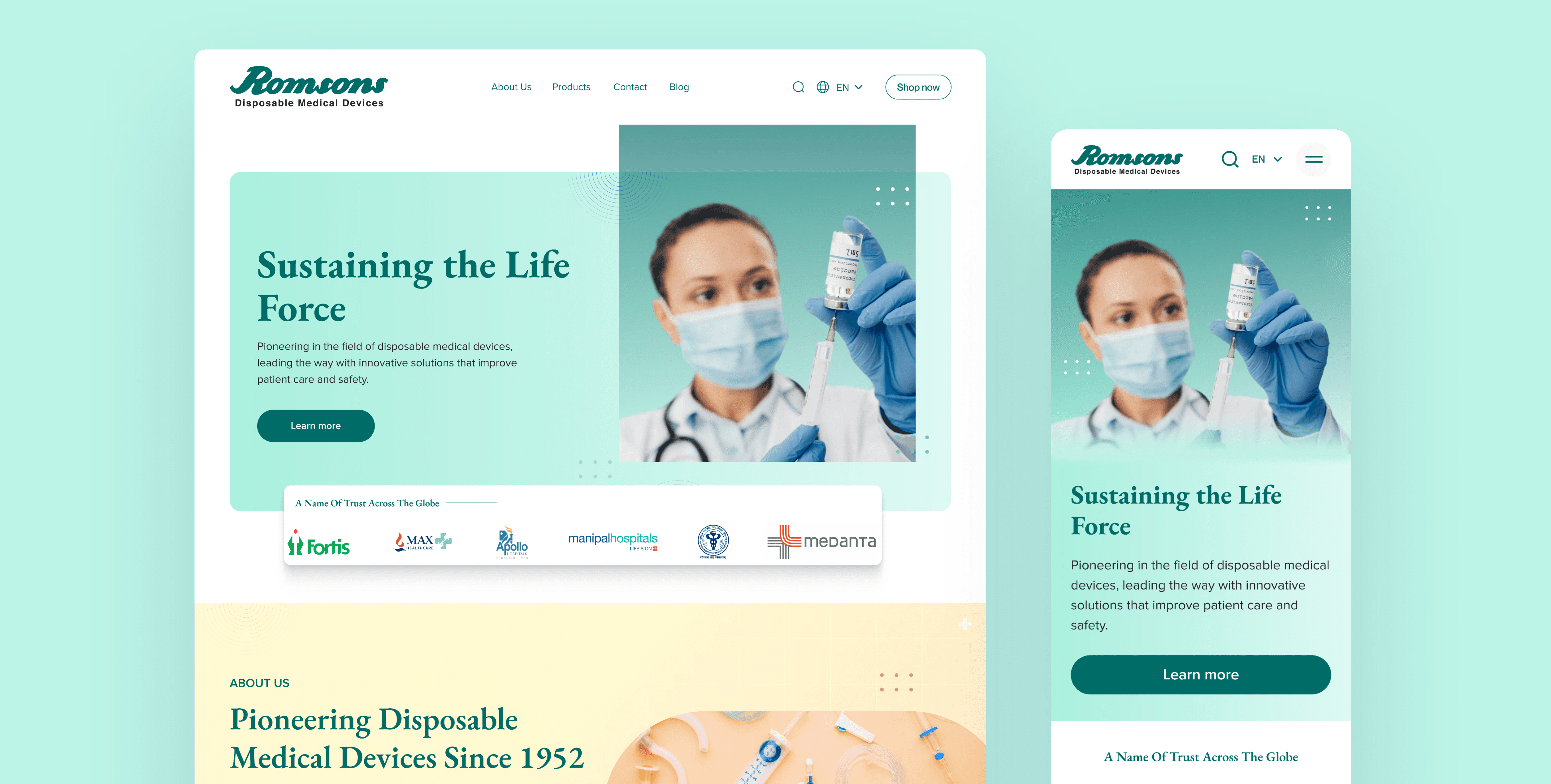
Revamped navigation for simpler, intuitive browsing
Revamped navigation for simpler, intuitive browsing
Revamped navigation for simpler, intuitive browsing
Revamped navigation for simpler, intuitive browsing
Revamped navigation for simpler, intuitive browsing
Revamped navigation for simpler, intuitive browsing
How I achieved this?
How I achieved this?
How I achieved this?
How I achieved this?
How I achieved this?
Standardized header height for a cleaner, modern look.
Reduced menu clutter and kept only essential links.
Introduced a clear “Shop Now” CTA for direct conversion of the users on their shopify platform.
Made search instantly accessible with a dedicated icon.
Improved responsiveness with a mobile-first sticky header.

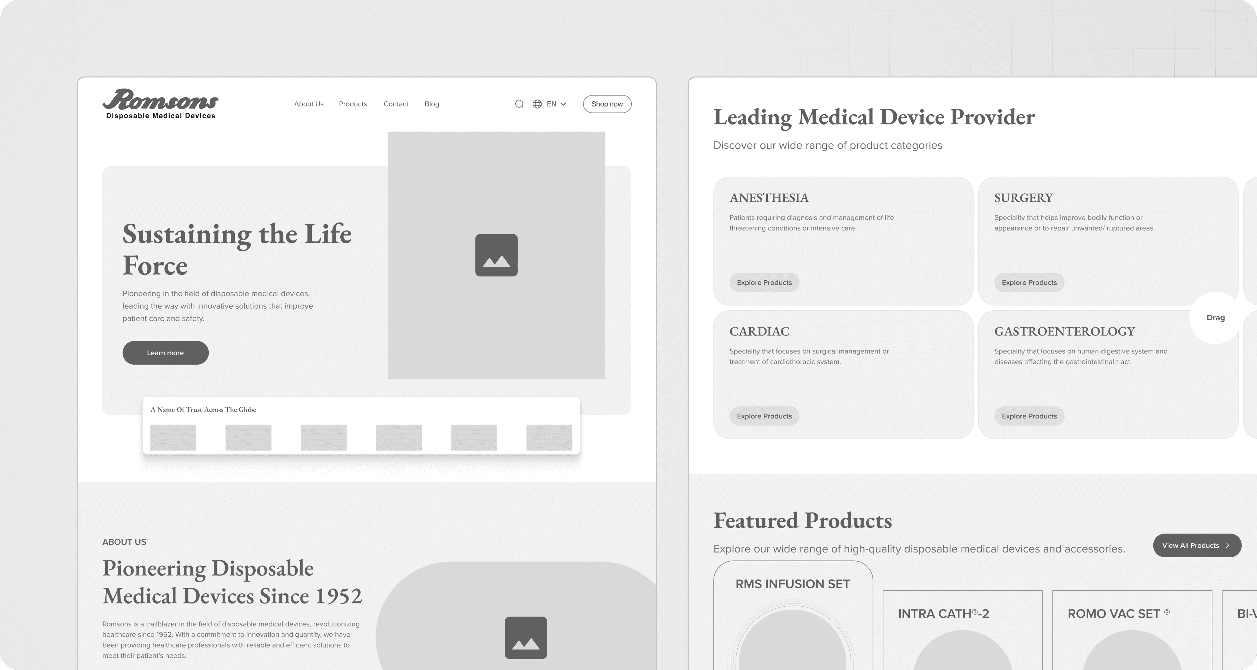
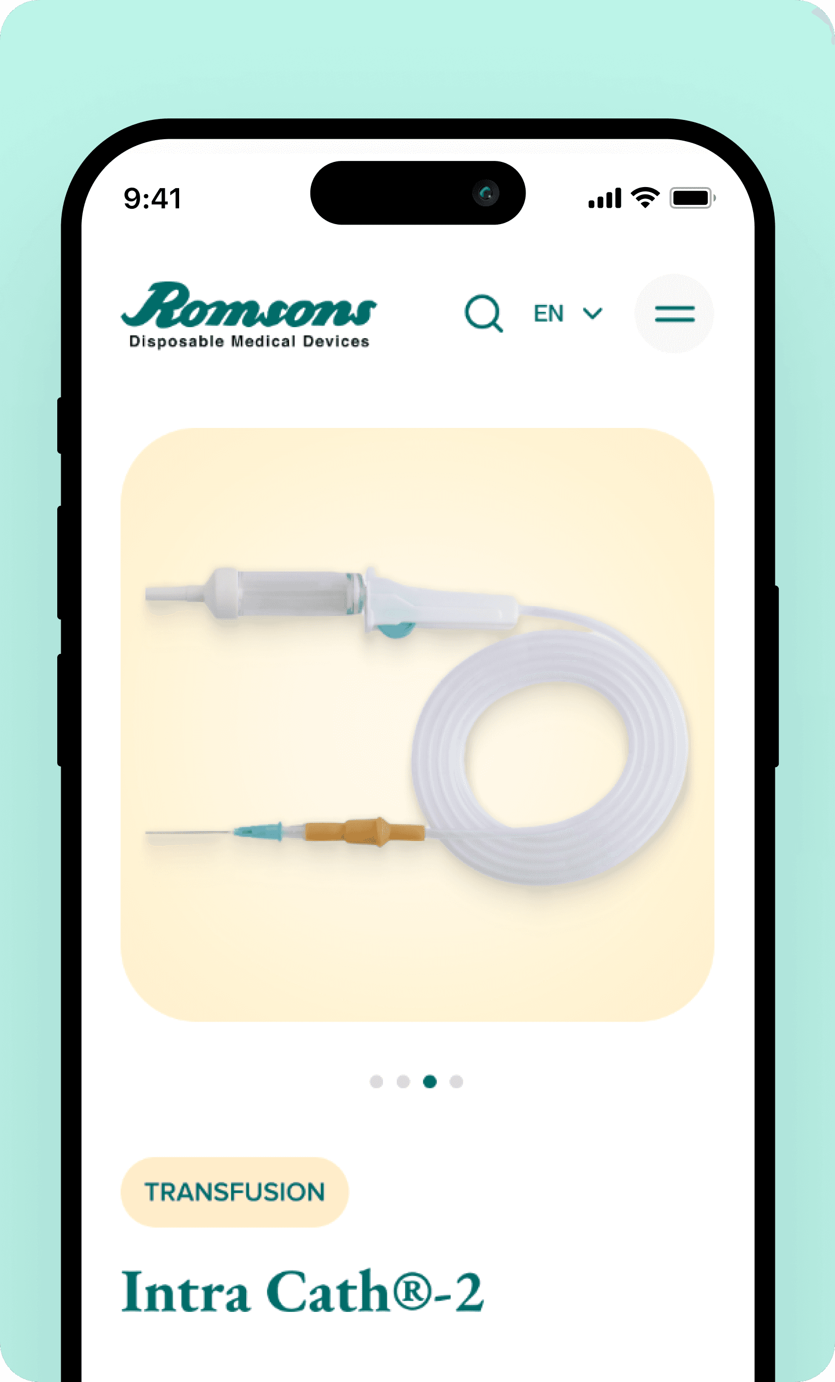
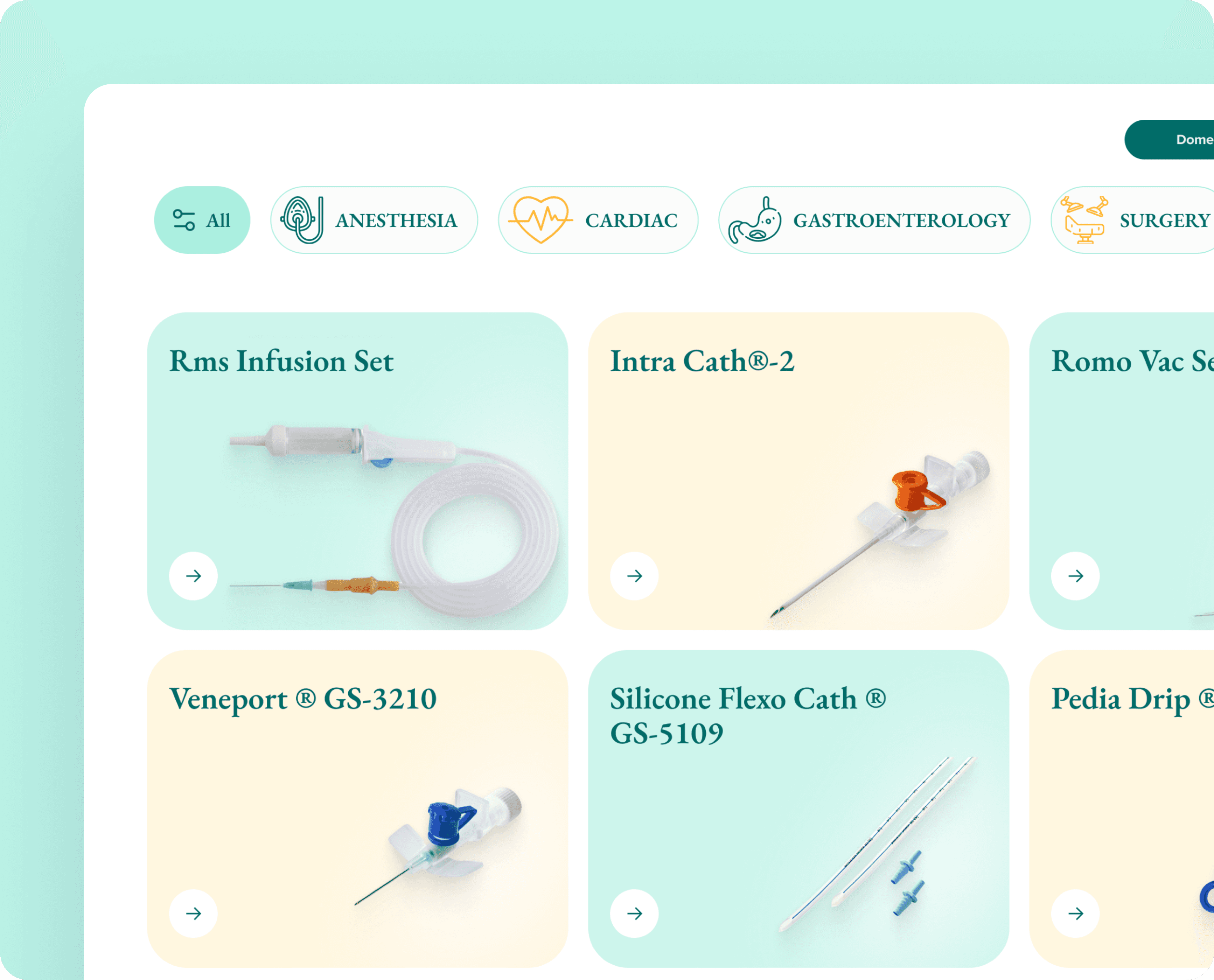
Enhanced product visibility And overall discovery
Enhanced product visibility And overall discovery
Enhanced product visibility And overall discovery
Enhanced product visibility And overall discovery
Enhanced product visibility And overall discovery
Enhanced product visibility And overall discovery
What I improved?
What I improved?
What I improved?
What I improved?
What I improved?
Redesigned product cards with clear hierarchy, clean spacing, and a strong CTA.
Introduced a modern grid layout with soft brand colors for better visual clarity.
Enhanced product listings with improved readability.
Simplified product detail pages with a focused image carousel and structured content.
Highlighted featured products on homepage to boost overall discovery.


A Modern Visual Upgrade
A Modern Visual Upgrade
A Modern Visual Upgrade
A Modern Visual Upgrade
A Modern Visual Upgrade
A Modern Visual Upgrade
Upgraded and refreshed the brand’s entire digital presence with cleaner & premium typography, refined spacing, consistent UI components, improved accessibility, and a unified design system across all touchpoints.
Upgraded and refreshed the brand’s entire digital presence with cleaner & premium typography, refined spacing, consistent UI components, improved accessibility, and a unified design system across all touchpoints.
Upgraded and refreshed the brand’s entire digital presence with cleaner & premium typography, refined spacing, consistent UI components, improved accessibility, and a unified design system across all touchpoints.
Upgraded and refreshed the brand’s entire digital presence with cleaner & premium typography, refined spacing, consistent UI components, improved accessibility, and a unified design system across all touchpoints.
Upgraded and refreshed the brand’s entire digital presence with cleaner & premium typography, refined spacing, consistent UI components, improved accessibility, and a unified design system across all touchpoints.


Seamless Across Every Screen
Seamless Across Every Screen
Seamless Across Every Screen
Seamless Across Every Screen
Seamless Across Every Screen
Seamless Across Every Screen
Designed consistent layouts across the screens, While improving brand familiarity, and reducing cognitive load.
Designed consistent layouts across the screens, While improving brand familiarity, and reducing cognitive load.
Designed consistent layouts across the screens, While improving brand familiarity, and reducing cognitive load.
Designed consistent layouts across the screens, While improving brand familiarity, and reducing cognitive load.
Designed consistent layouts across the screens, While improving brand familiarity, and reducing cognitive load.

The Impact
The
Impact
The Impact
The Impact
The
Impact
The Impact
36
%
User engagement increased as clearer content flow and purposeful visual cues encouraged users to spend more time interacting with the platform.
36
%
User engagement increased as clearer content flow and purposeful visual cues encouraged users to spend more time interacting with the platform.
36
%
User engagement increased as clearer content flow and purposeful visual cues encouraged users to spend more time interacting with the platform.
36
%
User engagement increased as clearer content flow and purposeful visual cues encouraged users to spend more time interacting with the platform.
36
%
User engagement increased as clearer content flow and purposeful visual cues encouraged users to spend more time interacting with the platform.
36
%
User engagement increased as clearer content flow and purposeful visual cues encouraged users to spend more time interacting with the platform.
36
%
User engagement increased as clearer content flow and purposeful visual cues encouraged users to spend more time interacting with the platform.
40
%
Product discovery improved as structured layouts and focused hierarchy helped users notice, understand, and explore Romsons product range.
40
%
Product discovery improved as structured layouts and focused hierarchy helped users notice, understand, and explore Romsons product range.
40
%
Product discovery improved as structured layouts and focused hierarchy helped users notice, understand, and explore Romsons product range.
40
%
Product discovery improved as structured layouts and focused hierarchy helped users notice, understand, and explore Romsons product range.
40
%
Product discovery improved as structured layouts and focused hierarchy helped users notice, understand, and explore Romsons product range.
40
%
Product discovery improved as structured layouts and focused hierarchy helped users notice, understand, and explore Romsons product range.
40
%
Product discovery improved as structured layouts and focused hierarchy helped users notice, understand, and explore Romsons product range.
1.5
%
Site visits grew steadily after improved information clarity and stronger first impressions made the platform feel more trustworthy and relevant.
1.5
%
Site visits grew steadily after improved information clarity and stronger first impressions made the platform feel more trustworthy and relevant.
1.5
%
Site visits grew steadily after improved information clarity and stronger first impressions made the platform feel more trustworthy and relevant.
1.5
%
Site visits grew steadily after improved information clarity and stronger first impressions made the platform feel more trustworthy and relevant.
1.5
%
Site visits grew steadily after improved information clarity and stronger first impressions made the platform feel more trustworthy and relevant.
1.5
%
Site visits grew steadily after improved information clarity and stronger first impressions made the platform feel more trustworthy and relevant.
1.5
%
Site visits grew steadily after improved information clarity and stronger first impressions made the platform feel more trustworthy and relevant.
46
%
Mobile retention improved significantly once responsive layouts and simplified navigation made browsing smoother across smaller screen experiences.
46
%
Mobile retention improved significantly once responsive layouts and simplified navigation made browsing smoother across smaller screen experiences.
46
%
Mobile retention improved significantly once responsive layouts and simplified navigation made browsing smoother across smaller screen experiences.
46
%
Mobile retention improved significantly once responsive layouts and simplified navigation made browsing smoother across smaller screen experiences.
46
%
Mobile retention improved significantly once responsive layouts and simplified navigation made browsing smoother across smaller screen experiences.
46
%
Mobile retention improved significantly once responsive layouts and simplified navigation made browsing smoother across smaller screen experiences.
46
%
Mobile retention improved significantly once responsive layouts and simplified navigation made browsing smoother across smaller screen experiences.
Let’s Talk Design
Let’s Talk Design
Let’s Talk Design